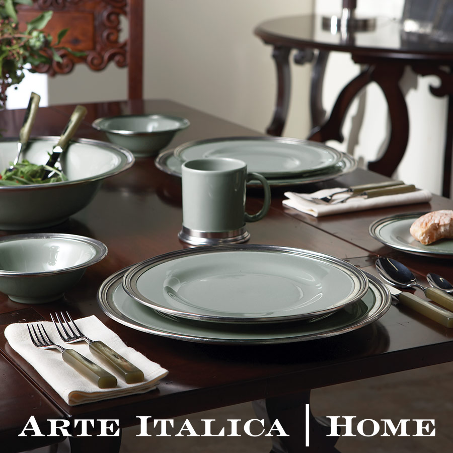


Client: Arte Italica
Role: Marketing, Creative Direction, Design, Image Retouching, Color Correction for Print, Print Production
We received this project while it was already underway. The first 16 pages had been designed, but the rest of the catalog remained. Arte Italica asked us to assist in getting it finished.
This catalog was completely custom made. Arte Italica wanted to lower their paper consumption, creating a book that was reusable for their sales reps. This will allow them to only reprint pages that change instead of the whole catalog. Everything was printed on recycled paper, too. :)
The tabs were created with a custom die to match the angled indexing on the catalog pages. We used a glossy stock for these tab divider pages to contrast the catalog pages in between, which were printed on a dull gloss stock.
We had a custom 3-ring binder created using French Speckletone Chocolate paper with a silver chrome foil stamp. The finished look we were going for was a dulled silver foil stamp, but due to the necessary matte plastic coating to protect the binder, the chrome foil was needed so the foil wasn’t too dull. If we had gone with the matte foil stamp, the matte plastic coating over the finished binder would have made it look like gray ink with no visible metallic sheen. We were able to preserve the pewter-like finish we wanted by using the wrong foil color.
Incidentally, the foil didn’t like to stick to the Speckletone – We had to pull a lot of sheets because the foil came off the paper too much. However, as the Arte Italica brand is founded on vintage Italian pewter, the slight flecking away of the foil on some pieces was desired and they were used.